GEOG 355 Term Project

Tracking Multi Decadal Patterns of River Channel Deposition and Migration Using the Landsat Archive

By James Stahl, 301 270 898

Introduction and Background

The Landsat mission has been collecting multi spectral remote sensing data since 1972. In 2008, the entire Landsat archive was made available over the internet free of charge, enabling scientists to reconstruct changes at the Earth’s surface at relatively high spatiotemporal frequencies (Gupta et al. 2013). The Landsat archive has proven to be particularly useful in quantifying the planform changes of actively migrating rivers over multidecadal time periods and has led to advances in river morphodynamic theory. The dataset has also facilitated the identification of controls on river migration, and continues to provide insight regarding the role of climate and human influences on planform adjustments (Schwenk et al. 2017).

In this study, planform dynamics of the Koyukuk River in Central Alaska are reconstructed over a time period of 32 years, from 1986 to 2018 using the Landsat archive. The study area was chosen because abundant signs of active channel migration were identified in satellite imagery, including oxbow lake formation, point bar deposition, mid channel bar deposition and migration, and cut bank erosion (Figure 1). The study reveals multiple examples of some of the ways in which the Koyukuk River has been dynamically adjusting to sediment and water fluxes over the last 3 decades.

Figure 1: Evidence of active channel migration along the Koyukuk River in Central Alaska. Examples of morphological changes include point bar deposition, mid channel bar deposition and migration, and cut bank erosion. Satellite imagery courtesy of Google Earth Engine.

Methods

Data Collection

Eight separate maximum-value, multi-temporal Normalized Difference Water Index (NDWI) composites were generated using historical Landsat 5, 7, and 8 datasets for a study area along a meandering reach of the Koyukuk river in Alaska. The NDWI composite method was applied in order to reduce the number of pixels containing high reflectance objects such as clouds or snow and allow for easy identification of pixels containing water. All Landsat data was collected and classified using Google Earth Engine. Images were pre-processed to surface reflectance.

NDWI uses a normalized ratio of 2 bands in the green and near infrared part of the electromagnetic spectrum to produce a matrix of pixels whose value ranges between 0 and 1. Pixels with values closer to 1 are more likely to contain water. The map projection was changed to WGS 84 ESPG 3857, and the final composite was created using images acquired during the summer months (between June 1st and September 1st ) at four to five year intervals for a 32 year period between 1986 and 2018.

Classification and Raster Addition

Pixels in each composite were classified using a series of 60 training points (30 for land, and another 30 for water identified in Landsat imagery) and a minimum distance classifier in order to delineate the location of the river through the creation of a binary mask. Pixels were classified as either ‘water’ or ‘land’ and given values of 1 or 0 respectively (Figure 2). Each image was inspected visually to ensure that clouds were not obscuring the river, however clouds and snow do occasionally appear in other parts of the imagery. Years with excessive cloud or snow cover were excluded from the analysis. The 8-year dataset was then imported into Terrset and each raster was added using the raster calculator to produce the final 32-year composite. Since there were 8 images in total, pixels with a value of 8 represent areas in which there was water present for every year throughout the 32-year period, and pixels with a value of 0 represent areas in which there was no water present at any during the 32-year period. Pixels with intermediate values represent areas in which there was water present some years, indicating changes in river planform (Figure 3).

Figure 2: (A) NDWI composite generated from maximum NDWI pixels acquired by Landsat 5 between June 1st and September 1st, 1991. (B) A binary mask for each year was created  by classifying each NDWI composite using a minimum distance classifier. Water pixels are assigned a value of 1, and land pixels are assigned a value of 0. Blue training points represent water, and pink training points represent land.
Figure 3: Location of the study area with a small-scale map of the 8-year NDWI composite of study area.

Results and Discussion

Changes in planform were detected at several locations throughout the study area. However, five locations were selected because they provide exceptional examples of significant morphological changes which took place throughout the duration of the study. These locations are presented below.

Figure 4 shows rapid point bar deposition along a meander bend in the Northwestern part of the study area. Shallow depths and reduced flow rates at the inside edge of meander bends cause suspended sediments to drop to the channel bed. These sediments are then deposited. Meanwhile, on the opposite side of the bank, sediments are eroded, but at this location the rate of erosion appears to be much less than the rate of deposition. The data at this site suggest rapid deposition of fine sediment at rates of between 30 to 60 meters every 4 to 5 years.

Figure 4: Point bar deposition and cut bank erosion along the Koyukuk River.

Figure 5 and Figure 6 show good examples mid channel bar development. Relatively small obstructions such as boulders on the river bed tend to cause a reduction in flow rates upstream of the obstruction. This in turn causes suspended sediments of varying size to be deposited upstream of the initial obstruction. Over time, the obstruction gradually increases in size, causing more and more sediment to be deposited as a result of decreased rates of flow- eventually leading to larger scale features such as the mid channel bars that can be detected in satellite imagery. In some instances, mid channel bars increase in size to the extent that new channels are formed in order to accommodate the discharge of the river (Figure 6). This can eventually lead to the transition from a predominantly meandering planform to an anastomosing planform.

Figure 5: Mid channel bar development and migration.
Figure 6: Advanced mid channel bar development and resulting planform changes.

Figure 7 shows what appears to be a landslide which occurred sometime between 1986 and 1991. A very large amount of sediment was rapidly deposited into the river and quickly swept downstream, leading to the development of an additional mid channel bar. Large deposits of sediment which are suddenly introduced into the river through mass wasting processes may have a profound impact on future changes in river planform.

Figure 7: Landslide deposit which led to the development of a mid channel bar. Flow is to the west.

In Figure 8, a different style of point bar deposition is shown from what appears in Figure 4 described above. In Figure 4, point bar deposition is occurring perpendicular to the direction of flow, whereas in Figure 8, point bar deposits appear to be accumulating in the direction of flow. This is likely due to reduced flow rates caused by some type of obstruction at the edge of the point bar, causing sediment to collect behind the obstruction quite rapidly. Meanwhile, the river is forced Northward into the cut bank. If cut bank erosion continues at the meander bend throughout the next several years, the river will eventually breach the area where cut bank incision is currently occurring. This will likely lead to the abandonment of the current channel, forming an oxbow lake.

Figure 8: Point bar deposition, cut bank incision, and oxbow lake formation.

Conclusion

Several areas were identified within the study area which show evidence of fairly rapid spatiotemporal changes in the landscape resulting from active channel migration along the Koyukuk River in Central Alaska. Observations include point bar deposition and cut bank erosion, mid channel bar development and migration, oxbow lake formation, and landslide/mass wasting processes. Together, these observations suggest a highly dynamic fluvial environment in which changes in landscape can be observed on decadal time scales using the Landsat archive.

A comprehensive understanding pertaining to changes in landscape morphology resulting from active fluvial processes is important for several reasons. For example, river deposits serve as an important source of aggregate which can be mined and used in the construction of roads and other infrastructure. Rivers also pose a significant threat to human development due to flooding and channel migration, which can ultimately result in loss of life and property. Therefore, an understanding of river morphodynamics and migration rates is imperative in predicting and planning for these inevitable events. Similar studies may be undertaken urban areas in order to reduce human vulnerability due to natural hazards which may be triggered by fluvial processes.

Limitations

There are several limitations in this particular study. Firstly, the Koyukuk River is situated at high latitudes characterized by relatively cold temperatures, and as a result the area is covered by snow for much of the year which tends to restrict data availability considerably. For example, when the river is covered by snow and ice, it becomes extremely difficult for classifiers to differentiate pixels containing water from those containing land due to similar reflectance values. The probability of obtaining suitable imagery is further diminished by cloud cover. This implies that data availability may be limited in areas which are frequently obscured by cloud or snow cover, meaning that this method may not be ideal in every situation.

Secondly, this study relies mainly on the visual interpretation of the final dataset. Tracking changes in river planform using cost distance methods in Terrset proved to be quite problematic and ineffective. These issues may be overcome by utilizing software packages such as RivMAP, which was specifically designed to measure changes in river morphodynamics over time. Using a series of binary water masks as inputs, the software is capable of measuring spatiotemporal changes in the channel centerline, banklines, channel width, centerline direction, and centerline curvature (Schwenk et al. 2017).

Thirdly, it is difficult to ascertain whether some of the changes observed in the final composite were due to differences in river stage (or water height). This is mainly because historical water levels for this study area were either unavailable, incomplete, or difficult to find. Water level information would certainly help to identify whether certain phenomena appeared due to a high discharge event during image acquisition or whether the observed spatiotemporal changes can truly be attributed to longer term morphological changes of the river channel.

References

Gupta, N., Atkinson, P.M., and Carling, P.A. 2013. Decadal length changes in the fluvial planform of the River Ganga: Bringing a mega-river to life with Landsat archives. Remote Sens. Lett. 4: 1–9. doi:10.1080/2150704X.2012.682658.

Schwenk, J., Khandelwal, A., Fratkin, M., Kumar, V., and Foufoula-Georgiou, E. 2017. High spatiotemporal resolution of river planform dynamics from landsat: The rivMAP toolbox and results from the Ucayali river. Earth Sp. Sci. 4: 46–75. doi:10.1002/2016EA000196.

LAB 7- BOOLEAN MULTI-CRITERIA EVALUATION

  1. In 20 words or less, what does ‘Boolean’ mean in the context of MCE? [1 mark]

Boolean refers to a raster grid which contains only two values which can either be ‘0’ or ‘1’.

2. Why is multiplication most used in Boolean MCE rather than addition or subtraction? [1 mark]

Areas which should not be considered according to a specific criteria are given a value of ‘0’ and areas which should be considered are given a value of ‘1’. When raster layers representing these criteria are multiplied, any areas which do not meet the criteria are omitted or masked out, and areas which should be considered keep their suitability scores.

3. Answer all the six questions in the purple boxes in the tutorial. [9 marks]

Question 1: What are the values units for each of these continuous factors? Are they comparable?

ROADDIST: Meters

TOWNDIST: Grid cell equivalents (gce)

SLOPES: Percent slope gradient

MCELANDUSE: Classes

According to the metadata for each continuous factor, the values units are all expressed in different units so they not (yet) comparable and will need to be reclassified.

Question 2: Can categorical data (such as land use) be thought of in terms of continuous suitability? How?

Categorical data can be regarded in terms of continuous suitability, provided that pixel values for each category are reclassified according to suitability criteria. For example, ‘open water’, has a value of 13 on the land use map; however, ‘open water’ is clearly unsuitable for future development so its value must be changed to ‘0’.

Question 3: What are the values units for each of these continuous factors? Are they comparable to each other?

WATERDIST: Meters

DEVELOPDIST: Meters

Values for WATERDIST and DEVELOPDIST are in meters so they are comparable.

Question 4: What must be true of all criterion images for MCEBOOL to have a value of 1? Is there any indication in MCEBOOL of how many criteria were met in any other case?

For a pixel in MCEBOOL to have a value of 1, all criterion images must also have values of 1. Without adding all of the criterion images to the same map window and using the identify tool to explore the locational values at a pixel with a value of 0, there is no indication of how many criteria were met in any other case. The most that can really be said is that at least one of the suitability criteria were not met, but it is also possible that all of the suitability criteria were not met. 

Question 5: For those areas with a value of 1, is there any indication which were better than others in terms of distance from roads, etc.? If more suitable land has been identified than is required, how would one now choose between the alternatives of suitable areas for development?

For areas with a value of 1, there is essentially no indication of which areas are better in terms of more specific suitability criteria. One option to choose alternative suitable areas would involve trying different scenarios by reclassifying criteria images. For example, if preserving open space is high priority, the suitability criteria in DEVELOPDIST could be changed from ‘less than 300 meters from developed land’ to ‘less than 50 meters from developed land’ to produce a new MCEBOOL map.

Question 6: Describe BOOLOR. Can you think of a way to use the Boolean factors to create a suitability image that lies somewhere between the extremes of AND and OR in terms of risk?

BOOLOR suggests that almost the entire town and the surrounding area would be suitable for development, aside from a very small patch of pixels in the lower right quadrant of the image.

4. Produce a professional location analysis product. This will take the form of a one-pager for a client who is looking in Westborough for suitable locations to develop one of the following facilities (select only one): graveyard; small airport; butterfly sanctuary; oil refinery; triathlon training course; children’s summer camp. [14 marks]

LAB 5- DISTANCE AND MACRO MODELER

  1. Work through TerrSet Exercise 2-3 Distance and Context Operators. You will have to finish it till the end in order to do the next exercise.[8 marks]

a) What is the difference between Euclidean distance and Manhattan distance? Give a real-world example of when each would be appropriate. [3 marks]

Euclidean distance is the direct straight line distance between two points, whereas Manhattan distance refers to the actual distance traveled between two points.

A real-world example of these two measures of distance would be the distance between two locations in downtown Vancouver. Suppose we want to measure the distance between Ted Northe Lane and Bute street to Forage restaurant. The straight-line distance would be the distance between the two points, disregarding any infrastructure or buildings that might be in the way, and the Manhattan distance would be the actual distance travelled by sidewalks and roadways.

b) Create a half-page map composition of your slope surface from step C. Include the cartographic model you created in macro modeler and explain what this map shows and what the values mean. [3 marks]

The Howe Hill Slope map displays the slope (in degrees) for each pixel in the study area. Slope values were calculated using the ‘relief’ DEM through the ‘surface’ module in Terrset.given point.

c) When you are creating your Boolean raster of buffers around the reservoirs, why is the buffer module more appropriate than distance module? [1 mark]

The distance module calculates a new image where each cell value is the shortest distance from that cell to the nearest feature, whereas the buffer module produces a categorical image. In this case, we are only interested in whether or not the building site for the new plant lies within the 250 metre buffer zone from the targets (reservoirs), and not the shortest distance from the reservoir to a given point. Therefore, the categorical (or Boolean) representation given by the buffer module is more appropriate than the continuous representation given by the distance module.

d) What is the area of the biggest suitable plot in your final Boolean map? [1 mark]

11.07 Hectares.

2. Work through TerrSet Exercise 2-4 Exploring the Power of Model Builder, up to the end of exercise I on page 87. [9 marks]

a) Once you recalculate suitable sites for up to 4.5 degrees slope, display the two maps (suitable and suitable2-4a) side-by-side; what are the major differences? [2 marks]

There are 2 major differences. In suitable2-4a, the original suitable plot has increased in size, and there are now several suitable plots that are 10 hectares in size or greater.

b) How many suitable plots did you find for the town of Westborough? [1 mark]

There are 22 suitable plots in the Westboro study area.

c) Give an example of a professional or academic GIS project where TerrSet DynaLinks would be used, explain why it would be used, and draw a basic cartographic model that shows this. You must include a minimum of three modules from TerrSet, and you may not use land use as an example. [4 marks]

An example of an application of dynalinks would be in modelling the spread of desert landcover (desertification) resulting from excessive grazing from livestock in ranch lands. Desertification resulting from ranching encourages desertification because livestock eat the vegetation which helps retain moisture in soils, preventing soil erosion. Root systems from grasses and other plants also help to prevent soil erosion.

 Creating a buffer zone which reiterates itself when it comes into contact with ranchland would create a visualization of where we can expect desert expansion. The drawback is that the model would need to account for areas adjacent to desert landcover which are unlikely to be affected by desert expansion. Temperature would need to be accounted for. 

d) Give an example of a project where you would create a submodel rather than a normal model in TerrSet macro modeler and explain why. [2 marks]

Sub-models are used to consolidate pre-existing models so that they may be easily incorporated into larger models. For example, the same sub-model could be used to run the same analysis for multiple areas cities. That way we would not need to construct the same model multiple times.      

3. Using TerrSet tutorial data, create and model a land use decision scenario. [8 marks]

Guidelines:
– You must use different datasets than those in exercises above. Explore the available datasets by setting the following as resource folders: Using TerrSet, Introductory GIS, Advanced GIS.

– You may use the same modules from the tutorials. However, the process must be original.

LAB 6 COST DISTANCE AND MAP ALGEBRA

1) Arrange the following data into a) quintiles, and b) five equal intervals. Present each classification clearly. [2 marks]:

12, 9, 13, 20, 15, 15, 19, 43, 8, 11

1a. 9, 12, 15, 19

1b. 8-15, 16-22, 23-29, 30-36, 37-43

2. Work through TerrSet Exercise 2-5 [Cost Distance and Least-Cost Pathways] 

a) What is the difference between isotropic and anisotropic frictions? Give a real-world example of each type of friction. Do not use the examples from the TerrSet tutorial. [3 marks]

Isotropic friction is independent of the direction of movement through an object or area. For example, a grass field will have a certain friction value regardless of the direction of travel. The grass field might have certain attributes that reduce or increase its friction, however friction does not depend on the direction.On the other hand, anisotropic friction depends on the direction of travel. For example, riding a bike up an inclined trail would result in a greater friction value, but riding downslope on the same trail result in friction being reduced.

b) Where is the airport? How might this affect the new line placement? How would you incorporate this into the cost-distance model? [4 marks]

The airport is located at the south-central part of the map. Power lines cannot be constructed within proximity to airports because incoming or outgoing planes could collide with the power lines, creating a major safety concern. The airport should be incorporated into the cost-distance model by constructing a buffer within a given distance to runways and assigning a very large value to the area encompassed by the buffer.

c) Create a full page map composition showing the location of the power plant, the airport, the existing line, and the best path for a new line. [5 marks]

Figure 1: Map composition showing the path of least friction for a new power line.

3. Work through TerrSet Exercise 2-6 [Map Algebra]

a) What is regression in the context of map algebra? Give an example. [2 marks]

Regression analysis gives us a means to model and predict spatial relationships between two or more variables using a linear mathematical equation. Regression models help explain the factors behind observed spatial patterns. For example, we may want to examine the relationship between yearly income (independent variable) and life expectancy (dependant variable) across space. If a linear relationship between these variables can be established, it can help us make predictions in areas where sufficient data is unavailable.

b) Why do we use regression in this exercise? Explain. [2 marks]

Regression is used because temperature tends to vary linearly depending on the elevation at which it is recorded (ie. temperature decreases as altitude increases). A significant linear relationship has been established to demonstrate the observed variation between the two variables. It is also used because only a finite number of data points are available as there are very few weather stations (representing the temperature for a very small number of pixels relative to the total number of pixels in the image) and we wish to predict a temperature value for every pixel.

c)Why is elevation the independent variable and temperature the dependent variable, rather than the other way around? [1 mark]

In much of East Africa, including Kenya, temperature and elevation are closely correlated. In most cases, the temperature of an area is essentially controlled by its elevation (ie. Changes in elevation result in changes in temperature, not vice versa- the higher the elevation, the lower the mean annual temperature).

d) When creating the rainfall/evaporation overlay, why is the ‘ratio (zero option)’ operation used? [1 mark]

The ‘ratio (zero option)’ was used because we need to overlay the two variables to predict moisture, which is the difference between rainfall and evaporation in the form of a ratio. Consequently, the final value is unitless.

e) Complete the optional problem on page 109, submit a full-page map composition. Add a description of your map including relevant details (i.e. suitability criteria for pyrethrum growth, your process of analysing the data). [5 marks]

In order to cultivate pyrethrum, the moisture availability range must be greater than 0.5 (corresponding to moisture availability zones 1, 2, and 3), and the temperature range must be 10 ℃ and 16 ℃ (corresponding to temperature zones 6, 7 and 8). To generate the final output, I used reclass to change the value of moisture zones 1,2, and 3 as well as temperature zones 6,7, and 8 to 1. I then changed the values of all other zones to 0. Finally, I used overlay to multiply both rasters so that only pixels which met both criteria remained (ie. pixels with a value of 1).

LAB 4 CARTOGRAPHIC MODELLING AND QUERY

  1. a) Sketch by hand a model, using the correct symbology, that uses the ‘POLYRAS’ module to rasterize a vector file named ‘Education’, then overlays the new ‘Education’ raster with a raster file image named ‘Malaria’. [1 mark]
Figure 1: A model for a vector to raster conversion followed by an overlay of two raster map layers.
  1. b) Give an example of a research question that leads you to overlay these two rasters. [1 mark]

What are the locations of educational institutions that are most likely to be affected by outbreaks of malaria?

2. a) What are the two fundamental types of query in GIS? [1 mark]

Query by location, and query by attribute.

2. b) Give an example of each type of GIS query, in the form of a question. [2 marks]

Query by location: ‘What is at this location’?

Query by attribute: ‘Where are all the locations that have this attribute’?

2. c) Read footnote 4 on page 9. Set C:/Temp/355-lab3 as the working folder, and C:/Temp /Introductory GIS as your resource folder. What is the difference between a working folder and a resource folder? [1 mark]

The working folder is where all outputs are placed, whereas a resource folder is a folder from which files can only be read. In other words, a resource folder contains the input files, and the working folder is where all output files generated in Terrset are allocated.

2. d) What is the spatial resolution, reference units, and min/max values of drelief.RST? [1 mark]

The spatial resolution is 30 meters squared, Reference units are in meters, the Minimum value is 5.0 meters, and the Maximum value is 15.9999 meters (16.0 m, 1 decimal place).

2. e) Give an appropriate, one-sentence research question for the task in this exercise (working with the DEM and soil type rasters). [1 mark]

How many hectares of land are located on clay soils that are also situated within normal flood zones? 

2. f) Bonus mark: in what town was the inventor of Boolean logic born? In what text did he publish his Boolean theory and what year was this? Give an example of two operations in ArcGIS that uses Boolean logic. [1 mark]

George Bool was born in Lincoln, Loncolnshire, England. He published his Boolean Theory in ‘The Mathematical Analysis of Logic’ in 1847. One example of Boolean logic in ArcGIS would be in the application of a raster mask which excludes pixels within a polygon (ie. If pixels fall on or within a predefined rectangle = True, display these pixels. If pixels fall on or within a predefined rectangle = False, exclude these pixels and remove them from the analysis.). Another example would be to exclude certain pixels from a digital elevation model (ie. If  0 m <pixel value< 100m = True, display pixels. If 0 m < pixel value < 100 m = False, remove and exclude pixels from the analysis).

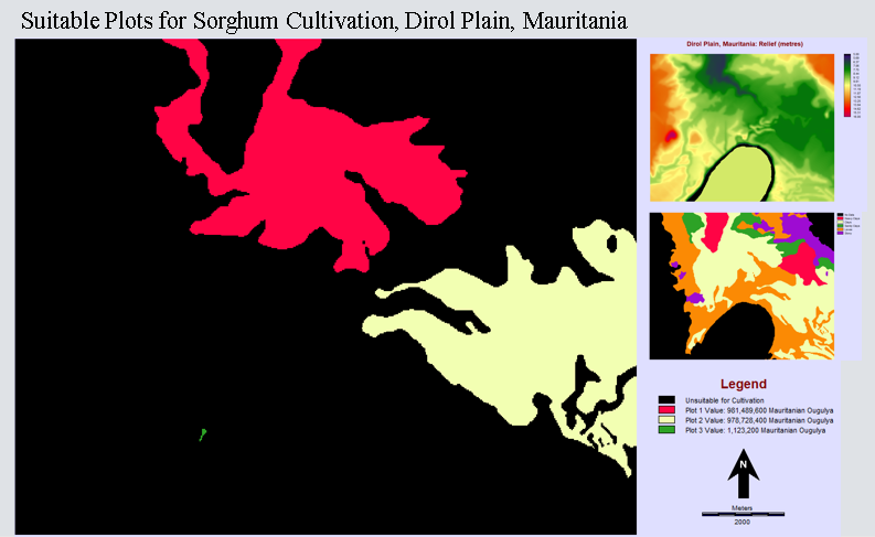
2. g) How many square meters are suitable for sorghum cultivation? [1 mark]

37,718,100 square meters are suitable for sorghum cultivation.

2. h) The average price per hectare is 520 000 Mauritanian Ougulya. Calculate the estimated market value of each plot identified in this exercise. [3 marks]

Plot 1: 1887.48 Ha ; Value: 981,489,600 Mauritanian Ougulya

Plot 2: 1882.17 Ha; Value: 978,728,400 Mauritanian Ougulya

Plot 3: 2.16 Ha; Value: 1,123,200 Mauritanian Ougulya

2. i) Using MS PowerPoint, create a mapsheet of the suitable plots for sorghum cultivation, with two smaller context maps showing the original relief and soils rasters. Include the estimated value of each plot. [9 marks]

Figure 2: Map composition detailing suitable plots for sorghum cultivation, the value of each plot in Mauritania currency, as well as insets detailing local relief and soil types.

3. a) Think about your research project topic for this course. What is the research problem or issue you want to address? [1 mark]

I would like to investigate any changes in the planform of the Bow and Elbow rivers (located between Calgary and Canmore, Alberta) over a time period of 20 to 30 years, using multi-temporal Landsat imagery and supervised or unsupervised pixel classification algorithms.

3. b) What is your draft research question? [1 mark]

Is it possible to detect changes in river planform of the Bow and Elbow rivers over a 20 to 30-year period using multi spectral, multi temporal satellite imagery? If so, what environmental factors could explain these changes? 

3. c) Provide one high-quality web-based or scholarly source of information on your topic (wiki, blogs, etc. are not appropriate here). [1 mark]

Gupta, N., Atkinson, P.M., and Carling, P.A. 2013. Decadal length changes in the fluvial planform of the River Ganga: Bringing a mega-river to life   with Landsat archives. Remote Sens. Lett. 4: 1–9. doi:10.1080/2150704X.2012.682658.

LAB 3 GEOREFERENCING

1.    Why do we need to change projected coordinate system rather than the geographic coordinate system? [2 marks]

A geographic coordinate system (GCS) uses a three-dimensional, spherical surface to represent locations on the Earth in terms of latitude and longitude. The problem is that our map is flat (ie. 2D). A projected coordinate system (PCS) is needed to overcome this problem by translating this 3D information into 2D space. A PCS always includes the GCS from which it is derived.  

2.    What location is the map that needs to be georeferenced referring to? Zoom into that location on your basemap (without overlaying the TIFF file), take a screenshot and paste it here. Give it an appropriate title and description. [2 marks]

Figure 1: Topographic base map showing the location of Cypress Gold’s Teepee Project.

3. Take a screenshot of your full extent TIFF overlaid with the basemap and paste it here. [1 mark] What is the name of the lake in the bottom left part of the TIFF map? [1 mark]

Figure 2: Initial overlay of a geologic map for Cypress Gold’s Teepee Project.

The lake in the bottom left is called Willow Lake.

4.      Take a screenshot of your Link Table with your final list of control points along with a screenshot of the map with the locations of the control points and paste it here. [1 mark]

Figure 3: Link table for the georeferenced geologic map.


Figure 4: Georeferenced geologic map with control points.

What do the residual values tell us? [1 mark]

The residuals give us the difference between the coordinates of the control points and the coordinates predicted by the geographic model using the control points. They provide a quantitative way of determining the level of accuracy of the georeferenced map.

Justify your selection of where you placed your control points and why you finalized your georeferencing with the final list of control points from the previous question. [4 marks]

Control points were selected based on identifiable points on each map. In this case, many of the control points are placed at locations where rivers or streams entered lakes. The final list of control points offered a good balance between the lowest total RMS error and the overall visual integrity of the image. For example, some points (such as points 1 and 2) have quite a high RMS error, but removing these points had the effect of warping the map in such a way that some features on the tiff did not match up correctly with features on the base map.

5.      Which transformation did you choose for your georeferencing and why? [3 marks]

I chose the ‘third order polynomial’ transformation because I used more than 10 control points. This transformation also significantly reduced the residual.

6.      Georeference the same image using a different projected coordinate system for your basemap. Which projected coordinate system did you choose and why? [2 marks]

NAD 1927 UTM Zone 8N- I chose this projected coordinate system mainly because it is compatible with the zone of interest (8N) and because I was curious as to whether the use of this older projection would have a significant impact on the overall quality of the map with respect to visualization and RMS error. 

Screenshot and paste the Link Table and the map with the control point locations here. [1 mark]

Figure 5: Link table showing the control points used in the NAD 1927 UTM Zone 8N georeferenced map.

Figure 6: NAD 1927 UTM Zone 8N georeferenced map.
Figure 7: A comparison of both maps.

List at least 1 pro and con of each projection system. [2 marks]

NAD 1927:

Pro: Smaller RMS error, and fewer control points needed. Con: Significant warping on final map.

NAD 1983:

Pro: Improved basemap accuracy over NAD 1927 due to higher density of initial reference positions, and less warping on final georeferenced map. Con: Larger RMS error when georeferencing.

How does the choice of a projection system affect further analysis using your georeferenced maps? [2 marks]

There is no projection system which preserves all properties of a map with perfect accuracy. Some projections preserve shape, while others preserve distance. Another projection might be better at preserving area or direction. In this case, further analysis using the NAD1927 projection system may yield reduced accuracy due to increased distortion of scale in each UTM zone as the boundaries between the UTM zones are approached

Lab 2- Data Structures and Database Workshop

  1. a) What is the difference between Integer, Byte, and Real Number data types?

Integer: Integers are non-fractional, or whole numbers that can be positive, negative or zero. In Terrset, files having an integer data type can contain any whole numbers from -32768 to +32767.

Byte: A Byte is a sub-type of integer that can only have positive values from 0-255.

Real Number: Real numbers are values of a continuous quantity. Real numbers can be thought of as points along an infinitely long line called a ‘Number Line’. Real numbers include all the rational numbers, the irrational numbers, as well as the transcendental numbers such as pi or e. In simple terms, real numbers are numbers that may contain fractional parts.

b) What is the difference between ASCII and UNICODE, and why is ASCII a more common GIS data type?

ASCII is an acronym that stands for the American Standard Code for Information Interchange. ASCII allows digital representation of alphabetic characters, numbers and symbols. An ASCII character uses 1 byte (8 bits) of memory.

UNICODE requires 2 bytes (16 bits) per character and was designed to handle non-US alphabet systems such as Chinese and Greek.

ASCII is a subset of UNICODE, but it is more commonly used in GIS because each ASCII character requires only half as much memory as a UNICODE character. However, in TerrSet, UNICODE is accepted for text layers because the software is used worldwide.

c) Give an example of when a quantitative bipolar palette is appropriate. Give an example of when a quantitative ramp palette is appropriate. Give an example of when a qualitative palette is appropriate.

Quantitative Bipolar Palette: Used to represent two distinct values represented by two color groups. A quantitative bipolar palette could be applied to a map depicting areas where the public can access clean water and areas clean water is unavailable.

Quantitative Ramp Palette: Representing an increase in value of some variable. A quantitative ramp palette could be applied to pixels representing elevation values in a digital elevation model (DEM)
so that variations in elevation over large areas are more perceptible to the map user.

Qualitative Palette: Represents various values that each have distinct attributes. A qualitative palette could be applied a map detailing the various geologic materials found within a region.

2. a) In this exercise, you classified Massachusetts census areas into quantiles. What is a quantile and why is it sometimes advantageous to use them?

Quantiles are intervals, or ‘cut points’ which are distributed over a range of values, such as a population distribution across geographic space. Quantiles are advantageous for organizing and displaying a dataset by ranking values categorically.

Give another example of when quantiles would be a better classification method than a linear color ramp.

One application would be for classifying the average household income in a city or county. For example, one colour could represent an average income of less than $12,000 annually, followed by another color representing an average income of anywhere between $12,000-24,000, and so on.

b) What is the name of the town in the database table with the greatest population in the year 2000? (Select the field, then click Query > sort Descending).

The town with the greatest population in 2000 is Boston, Massachusetts, which had a population of 588,957.

c. What is the 1980 population of the town with the greatest area?

The town with the greatest area in 1980 is Plymouth, Massachusetts, which had a population of 38,384.

3. a) How many towns are there in total? (Look at ‘Records’ in the bottom panel of the Database Workshop window).

There are 351 towns according to the records panel.

How many towns have a population change greater than zero between both 1980-1990 and 1990-2000?

There are 249 towns that experienced a population change of greater than zero between both 1980-1990 and 1990-2000.

b) You calculated a new field [PopCh80_00] in the ‘Calculate’ section of the exercise. What is this and what are the units of measurement?

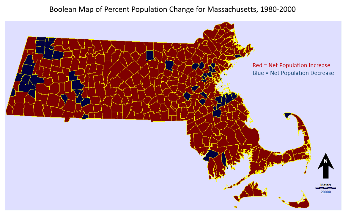
This represents the difference in population from 1980 to 2000 represented as a ratio to the population in the year 2000, expressed as a percent. In other words, the calculation gives the percent increase or decrease of the population in each town over the 20 year period between 1980 to 2000.

c) In section ‘h’ of the exercise, you create a choropleth (quantitative classified colored polygons) map. Reclassify this into 16 Standard Scores (standard deviations). Use the cursor inquiry tool to find the name of the town with the greatest population decline. What is the name of this town?

Harvard.

Why do you think it has experienced such a drastic population decline between years 1980 and 2000?

The drastic population decline can likely be attributed to the closure of a large military installation in Fort Devens in 1996. This resulted in the departure of military personnel and their families. A large part of the military installation was located in the town of Harvard. (Wikipedia)

d) Create a map composition of the map you created in 3c, using MS PowerPoint. Submit this as a separate page, including all necessary map elements. 

e) In section ‘i’, look through the different tabs in the Massachusetts database file. How many hospitals and schools are in Massachusetts, according to the database file?

According to the database file, there are 145 Hospitals and 2521 Schools in Massachusetts.

f) Which town experienced the greatest growth between years 1990 and 2000? Why do you think this is?

Boston experienced the greatest growth between 1990 and 2000. The population increase during these years could be related to international immigration. Another possibility is that people are attracted to Boston for entrepreneurial reasons- the city has one of the largest economies in the United States.

g) Complete the ‘challenge’ section on page 55 of the tutorial.

LAB 1- GETTING STARTED WITH TERRSET

By: James Stahl, 301 270 898

  1. d) In Windows Explorer, go to D:\Temp\355-1. Find the new .rdc file, right-click and select ‘edit with notepad++’. Read the metadata very carefully. Which coordinate system does this raster use? (0.5 marks).

The Coordinate Reference System (CRS) for ASTGTM2_N48W125_dem.rdc is specified as latitude/longitude, (ie. lat/long) in degrees (°).

  1. e) Find the same metadata in TerrSet Explorer. What is the resolution? (0.5 marks)

X resolution = 0.00027777778 °

Y resolution = 0.00027777778 °

° = 111,139 meters

(https://sciencing.com/convert-distances-degrees-meters-7858322.html)

What are the units of measurement (i.e., what do the pixel values represent?) (0.5 marks)

In this case, the reference units are in degrees, so each pixel is a square with width/height of about 0.00028 °, measured from the centre of the Earth. Converting from degrees to metres indicates that each pixel has an area of about 31 m2. In other words, this information provides the spatial resolution of the dataset.

What is the extent (max and min coordinates)? (0.5 marks)

Max X: -123.9998611 °

Min X: -125.0001389 °

Max Y: 49.0001389 °

Min Y: 47.9998611 °

2. Basic map composition. [Total: 3 marks]

a) Open the DISPLAY Launcher dialogue and open ASTER_N48W125. Use a non-default palette to display; find ‘Quant_kilimanjaro’ in the ‘Palette File’ pick list. Also display the same raster file using a qualitative colour palette.

Why is a qualitative colour palette not appropriate for this DEM? (1 mark)

Each colour in the qualitative palette represents a wide range of values, so variations in elevation within each class are obscured, reducing the amount of information provided by the DEM. In my case, the qualitative palette I chose had an interval of 93 m per class, so the coastline appears to be further inland than it is in reality. Qualitative palettes are generally used with vector data.

b) Copy the image using Windows Print Screen (Print Screen key in your keyboard), crop it with MS Paint so that the window borders are not visible, and paste in your lab answer sheet. Using MS Word, add a descriptive title and a description that introduces the meaning of the palette and the context. (2 marks, +1 bonus mark if you can identify where this is, and include it in your map title). 


Figure 1: A digital elevation model of Southern Vancouver Island and the Olympic Peninsula. Low elevations are represented by ‘cooler’ colours (blacks, purples, and greens), which transition into ‘warmer’ colours as elevation increases. North is toward the top of the page.

3) Vector data and raster data are two major GIS data formats. Compare the differences by answering the following questions a) and b). [Total: 5 marks]

a) Describe the key differences between raster and vector data in your own words. (1 mark)

Vector data can be described as layers with individual objects composed of points, lines, and polygons, all of which can be assigned attributes which describe them. Vector data is resolution independent.

Raster data is composed of a matrix of pixels. Each pixel represents a predefined area in geographic space with a specific value assigned to each pixel. Values may represent an elevation for a specified area (a DEM for example) or the average surface reflectance value derived by measuring electromagnetic energy with a sensor. A digital photograph is an example of raster data. Raster data is resolution dependant.

b) Give an example of a GIS problem where raster is better, explain why. Give an example of a GIS problem where vector is better, explain why. (4 marks).

Problem: Mapping environmental changes for large areas over time (such as vegetation health or river planform)

Solution: Multi temporal raster data

Why: Landsat, for example, images the same location on the Earth’s surface every 16 days, which makes it ideal in environmental change detection over large areas, provided areas of interest are not consistently obscured by cloud cover. Images can be pre-processed and converted into single band images (NDVI, NDWI, etc.) and classified using supervised and unsupervised classification techniques, allowing thematic maps with spatial distributions of multiple land cover classes be quickly constructed and compared over time. Manual mapping techniques are not as practical in these types of applications because they would be quite time consuming and would yield results that are largely based on the experience level of the mapper.

Problem: Multi temporal socio economic analysis in a large city

Solution: Vector Data

Why: Census data may be joined to a shapefile containing polygons corresponding postal codes which are spatially distributed across an urban metropolis, allowing the creation of maps with which data such as demographics, unemployment, crime occurrences can be grouped and displayed thematically. Data in each postal code can then be compared visually by separating the data into categories or ‘bins’ and displaying these data as different colours within each postal code polygon.

4) Re-examine the metadata for the ASTER DEM using TerrSet Explorer. [Total: 2 marks]

a) What are the minimum and maximum values in this image? (1 mark)

Minimum pixel value (m): -1

Maximum pixel value (m): 1504


b) Create a new colour palette: Open Symbol Workshop and create a new palette file and name it as “ASTER_DEM.smp”.  Assign gray color for 0 and greater than 20. Assign the colour red to value 1 and blue to value 20.  Use Blend button to blend values between 1 and 20.  Copy the Symbol Workshop window using Windows Print Screen (Print Screen key in your keyboard) and paste the output window in your lab answer sheet. (1 mark)

5. Apply the new ASTER_DEM.smp palette to your ASTER_N48W125.rst image. [Total: 6 marks]

a) Add a Title, North Arrow, and Scale Bar. Change the text font, colour, and size. Copy the Image using Windows Print Screen (Print Screen key in your keyboard), crop it in MS Paint, and paste the output window in your lab answer sheet. (3 marks)


b) What does the resulting map show? What is wrong with this? How might this be valuable? (3 marks)

This particular map shows variations in elevation from 0 metres to about 120 metres above sea level on Southern Vancouver Island in British Columbia and the Olympic Peninsula in Washington State.

The main problem with this map is that it does not provide information pertaining to elevations above 120 metres, however the map may be useful in coastal studies. For example, a wildlife ecologist studying shorebirds may be interested in mapping the aerial extent of tidal flats (shorebird habitat) situated within this scene, and a map such as this would help to narrow down where tidal flats may be located.


6) Compare the file types used in TerrSet and ESRI ArcGIS by answering the following questions. [Total: 5 marks]

a) What are the roles of TerrSet raster group files (.rgf), vector link files (.vlx), and environment files (.env)? (1.5 marks)

The .rgf extension refers to a file containing a list (or group) of associated raster layers which can be accessed (and created) through Terrset explorer. Raster group files help keep data relevant to a particular project organized and easily accessible.

The .vlx extension refers to a vector link file, which creates a link between a vector spatial frame and a database table that contains the information for a collection of attributes related to the features in the spatial frame.

The .env extension refers to an environment file, which maintains Project settings for each particular project.

b) What is the difference between an ESRI shapefile and an ESRI GRID? (1 mark)

An ESRI GRID is a raster storage file used in ESRI GIS software such as the ArcGIS package, Whereas ESRI shapefiles contain vector data.

c) Write 150 to 200 words on a project idea for your 355 final project. What is the GIS problem that you would like to investigate, and how might you do this? (2.5 marks)


Beginning on June 19th, 2013, my hometown of Calgary, Alberta experienced a catastrophic flooding event which was subsequently described by the provincial government as one of the worst floods in Alberta’s history. I intend to investigate any changes in the planform of the Bow and Elbow Rivers which may have occurred due to the event in an area between the cities of Canmore and Calgary, Alberta by conducting a time series analysis of Landsat 7, and 8 Imagery. I will accomplish this by locating the relevant landsat path(s) and row(s) of interest, and then download metadata for these locations for the years leading up to the flood (1985-2013) as well as subsequent years (2013- Present). I will mainly be interested in obtaining imagery for the area during the summer months when there is minimal snow and cloud cover (<15%). I will then download the landsat imagery and apply a satellite derived index from the Green and Near Infared bands (referred to as the Normalized difference Water Index, or NDWI) in order to classify land and water in the area using minimum distance supervised classification or through manual thresholding, which should generate a map showing the location of the river at a particular time. The classified images can then be analysed qualtitatively by visual inspection, and quantitatively using ‘class stats’ package available in RStudio.